
Street Fighter VI is finally, after a string of excellent promotion, attracting controversy over a rather dull cover featuring rather dull protagonist Luke. And while we don’t know if it’s final (the first logo shown wasn’t), it would be a shame if such a promising game was let down by terrible box art. Because Capcom has been employing amazing artists like Akiman, Bengus, Shinkiro and Kinu Nishimura, so every piece of cover art in the history of Street Fighter has been amazing. Wait, it hasn’t? Let’s have a look.
(most pictures taken from Mobygames)

Okay, they may be excused at this point, because art direction wasn’t a thing in the mid 80’s and at least this looks fairly human, and Ryu’s red hair and shoes are properly included. Even though he never fights a guy with nunchukus. 2/5

Ah yes, Street Fighter 1 (named Fighting Street in the PC Engine version) famously had Ryu fight Mt Rushmore. At least we get vague representations of Geki and Joe, who could use any visibility they can get. Wait, who the hell is that next to Lincoln? 1/5

But it’s unfair to judge third party artwork, right. The original Japanese art is always superior. Oh, wait. This is Akiman’s art for Street Fighter II, and I see nothing right with it. And since when is Zangief a sailor? 1/5

Mick McGinty drew many of the classic western covers of Street Fighter and again, technically it’s fine. It’s just goofy, out of proportion and it makes Chun-Li ugly. Variations of this art was used across most of the ports, but the Amiga cover adds the individual artwork as insult to injury. McGinty passed away last year so all respect to him, and at least it’s better than Akiman’s. 2/5

Several versions of the Champion Edition ports got this art by Shoei. It has a cool look overall but breaks down as soon as you look closer at Ryu’s face. 2/5

Mick McGinty once again came to the rescue with a technically sound cover, which also makes no sense. Bison looks cool and you gotta love that chrome, but Guile is extremely awkward. Yes, we need to focus on his neck, that’s iconic. 2/5

Okay, here we go. This piece by Kinu Nishimura is actually awesome. One of the best Street Fighter covers ever. 5/5

And the hat trick by Mick McGinty, showing two muscular dudes with muscles on top of their muscles, being mildly annoyed at each other in a public bath house. I’m sorry, but this is terrible. 1/5

This art for the Japanese Mega Drive is pretty awesome … but it’s also just art by Shuko Murase from the movie and has no real connection to the game, including that cliff face that doesn’t appear in it. So it can’t get better than 3/5.

This is apparently also by McGinty, but you couldn’t really tell. It’s obvious that Capcom USA spent no budget on this piece. 1/5

As if it couldn’t get any worse, the orientation of the SNES boxes meant that this had to be even more boring. 1/5

An obscure cover for the Japanese version of an obscure port, but as a collaboration of Kinu Nishimura, Bengus and Shoei it’s pretty great, despite the sketched artwork. At least there’s plenty of personality in the portraits. 3/5

The US version of the game unfortunately focuses on the weakest part of the artwork. I guess it’s better than the next ones though. 2/5
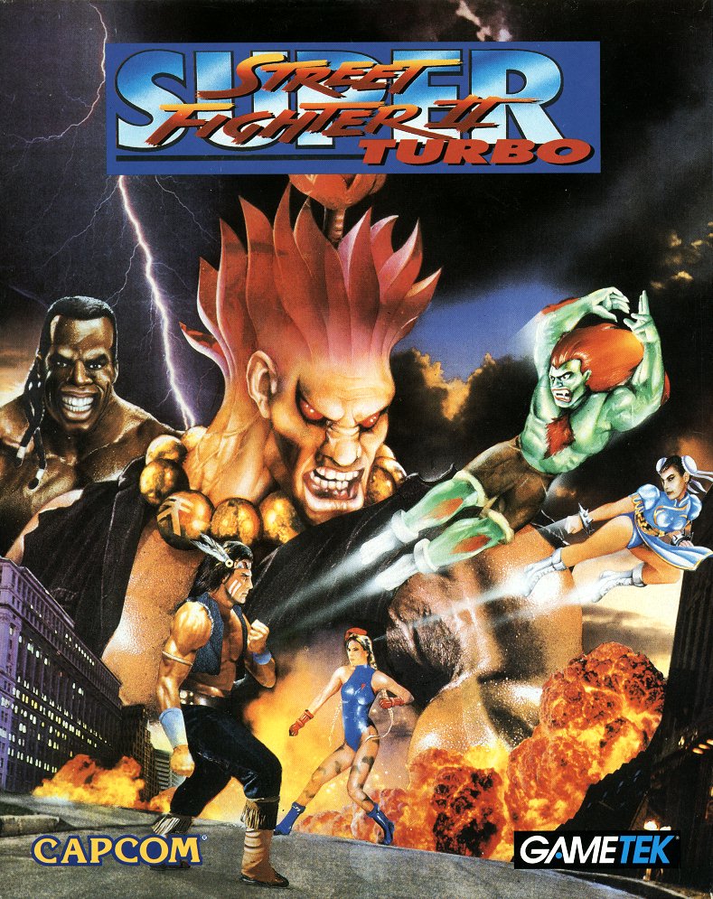
Gametek produced a surprisingly excellent PC port of Super Turbo, but this uncredited artwork is one of the worst in history. I don’t know where to start, maybe with the photorealistic shoulders of Akuma topped with a head that makes no anatomical sense. 1/5

I can’t find who made this cover for the late Dreamcast port, but it’s pretty good in its simplicity. 3/5

Since Super Turbo has been ported to everything, it has had plenty of opportunity for new artwork. Edayan did amazing art for this version and this is up there with Nishimura’s at the top. 5/5

”Oh no, we have this amazing cover art but it’s in horizontal and we need a square piece for the western release.” ”Just paste in all the individual art randomly.” Edayan is still great, but the composition kills this. 2/5

The main point of Alpha was that Ryu and Ken were younger, and this moody piece by Dai-chan gets the point across. 3/5

Of course, some American business person saw the previous art and nearly threw up from the complete lack of action, and then commissioned this piece to really sell the western versions of Alpha. Nevermind the horrible anatomy, what’s up with the random ”ten” shadow on the ground and Bison’s malformed head on top of the logo? 1/5

Very surprisingly, this amazing art by Dai-chan was used for nearly all versions of Street Fighter Alpha 2, even internationally. 5/5

Bengus, Ikeno and Edayan were nearly interchangable at this point so I couldn’t make it out at first, but this is Edayan’s cover of the Japanese Saturn release and unfortunately quite dull. 2/5

Street Fighter Alpha 3 also had a million releases with plenty of art, but many of them use variations on this art by Edayan. It’s pretty cool and shows off how the game has a ton of characters, but it’s a bit ruined by the cover logos on many releases. 3/5

Of course, Capcom USA couldn’t resist ruining it by pasting Zangief on top of an already busy cover and adding torn paper shit around the edges. 1/5

The later version on PSP added in a focus on Evil Ryu for no real reason. 2/5

Harumaru hasn’t done much promotional art, but this Saturn version cover was pretty neat, a bit busy but still showing off characters much better than the original. 3/5

I can’t find the artist for this, but I’m thinking Ikeno. Either way it’s pretty bad, with a backlit off model Ryu taking up all the space. 2/5

The Japanese Dreamcast version deserves extra attention and ridicule. The first thing that strikes you is probably the (intentionally) boring composition and simple art. The second thing that strikes you is the (hopefully unintentionally?) super racist portrayals of Balrog and Birdie. This is by Ikeno, and yes, he should be named and shamed for this. 0/5

The cover of the first Street Fighter EX home port wanted to show that unlike the excellent spritework of previous games, this game had super low poly models. What the hell happened here? 1/5

This is marginally better, but still a hopelessly ugly 3D rendition of Ryu. Strangely enough, Capcom had some amazing promotional artwork of EX by Edayan around this time, but chose to go with horrible 3D. 1/5

Ikeno strikes again! This is actually fairly cool despite having to promote characters like Ace, Shadowgeist and Area. 3/5

And of course the western release needed to focus on the 3D graphics, and by ”focus” I mean zoom in on the in-game model and add a shit-ton of motion blur. 1/5

Kinu Nishimura returns for the main illustration for Street Fighter III: Second Impact, which was used for the Dreamcast collection of the first two games. 4/5

Meanwhile, Capcom USA decided that they didn’t want to sell the game. 1/5

No, I still don’t like Ikeno’s art. This is sorta fine, but nowhere near great. 2/5

At least the Japanese version was an actual cover. This just pastes in individual artwork again for the western releases. And did noone notice that Gill is cross-eyed? 2/5

I think this Ikeno piece for the Playstation 2 version is fairly well liked, but I don’t. Proportions are all over the place. 2/5

Before we move into the modern era, let’s look at some major collections. The first collection for Playstation and Saturn included Super, Super Turbo and Alpha 2 Dash, and had this excellent cover by Edayan. 4/5

In fact, in this case the JP art was much inferior. The sketch itself is fine, I guess, but there’s just nothing here to excite. Capcom doesn’t list this as a main illustration for a reason. Later, the second Street Fighter collection just reused the cropped Turbo cover by Nishimura again, so that was even less effort. 2/5

When Capcom wanted to celebrate the 15th anniversary of Street Fighter, they did it with this horrible piece by Ikeno. I know, close perspective is hard, but that’s no excuse for what he did to Akuma and Zangief. 1/5

Things get simpler with the modern era where Street Fighter IV had the same cover across all versions. This uses a classical theme and showcases the brushwork that influenced the style of the game. But Ryu looks like he just realized he left the gas stove on before he left home (five months ago). 2/5

I’m pretty sure this is just the in-game models with the new sketch filter introduced in Super Street Fighter IV on top of them. It’s just ugly. 1/5

Another cover just using in-game models, and for some reason they kept trying to make Adon a thing. Small plus points for a composition that reminds me of the older games. 1/5

Another portable version, another patchwork of character artwork. 2/5

Ultra Street Fighter IV was mostly digital so there wasn’t really a cover to care about, but they did provide a fairly badass artwork for Ryu so there’s that. 2/5

Street Fighter V used this similar Ryu art across all editions. I don’t have any newer artbooks so I can’t tell who drew it or if it’s a render. It’s okay, but boring. 2/5

Out of nowhere, this alternate artwork for the Japanese ”Hot Package” edition of Street Fighter V gave us Hot Ryu and Hot Chun-Li. The art by Kiki, who also made all the million characters on the Street Fighter V website, is a bit rough but has a lot of charm. After having been on 36 box arts either scowling or screaming, Ryu finally got to smile. 3/5

We return to our regular realistic takes on Ryu and Chun-Li for Street Fighter V: Champion Edition. This is pretty good as these things go, but pales compared to some earlier art. 3/5
So there we have it, most of the Street Fighter box arts. If I missed some, have a good tantrum about it. Capcom has certainly had some excellent art, especially by Kinu Nishimura, Dai-chan and Edayan. I find Ikeno extremely overrated though, and that Alpha 3 cover really has no excuse. In this context, what about that Street Fighter VI cover?

Technically fine, good colours, dull protagonist. Eh, it’s fine. 2/5